October 2025
Posters are asked to do too much!
On why posters fail and what happens when you design them backwards.
On why posters fail and what happens when you design them backwards.

Inform. Instruct. Persuade. Prompt action. All at once. On one sheet.
That's usually where it goes wrong.
Through our Noora Health work I've seen this pattern repeat. A poster becomes the default answer before anyone has asked the right question. Then it gets loaded up. Text on text. Three calls to action. A stock image nobody connects with. A template from three years ago.
Nobody reads it. Not because people don't care. Because the poster wasn't made for them, it was made for the brief.
What I've come to understand:
A poster can only do one thing well. The moment you ask it to do two, it starts doing none.
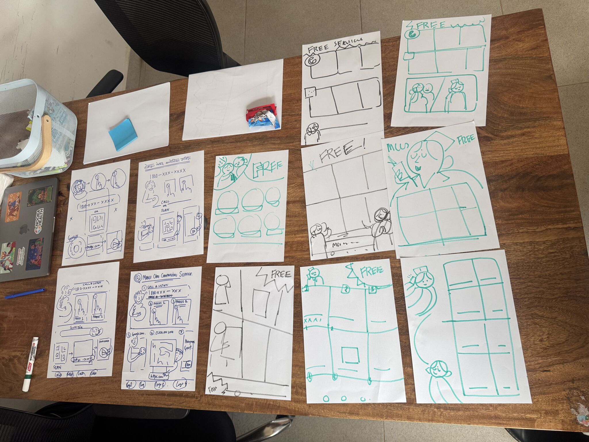
Vidushi and I spent some time recently just sketching. Rough drafts, no polish. The practice was simple: put an idea down, then strip out everything that shouldn't be there. One message. Clear hierarchy. Visuals that actually belong to the context. Get it to one or two ideas worth developing before anything goes to the team.
What that process keeps reminding me:
Good posters aren't designed from what you want to say. They're designed from what the person in front of it can absorb, in the moment they're standing there.
That gap between the two is where most posters get lost.
And the honest part:
This doesn't happen by default. It takes someone in the room willing to say "this is too much" and mean it.
Inform. Instruct. Persuade. Prompt action. All at once. On one sheet.
That's usually where it goes wrong.
Through our Noora Health work I've seen this pattern repeat. A poster becomes the default answer before anyone has asked the right question. Then it gets loaded up. Text on text. Three calls to action. A stock image nobody connects with. A template from three years ago.
Nobody reads it. Not because people don't care. Because the poster wasn't made for them, it was made for the brief.
What I've come to understand:
A poster can only do one thing well. The moment you ask it to do two, it starts doing none.
Vidushi and I spent some time recently just sketching. Rough drafts, no polish. The practice was simple: put an idea down, then strip out everything that shouldn't be there. One message. Clear hierarchy. Visuals that actually belong to the context. Get it to one or two ideas worth developing before anything goes to the team.
What that process keeps reminding me:
Good posters aren't designed from what you want to say. They're designed from what the person in front of it can absorb, in the moment they're standing there.
That gap between the two is where most posters get lost.
And the honest part:
This doesn't happen by default. It takes someone in the room willing to say "this is too much" and mean it.